- 800-720-0816


Here’s Why You Need to Make Sure Your website
Beginning April 21, 2015, Google will change the way it ranks websites. Google announced this on its webmaster blog way back in February and has been doing a lot of changes since then in preparation for the 4/21 update.
Here’s what they said :
“Starting April 21, we will be expanding our use of mobile-friendliness as a ranking signal. This change will affect mobile searches in all languages worldwide and will have a significant impact in our search results. Consequently, users will find it easier to get relevant, high quality search results that are optimized for their devices.”
If your site is not mobile friendly yet, its almost certain that you will see a hit to your ranking on mobile searches.
Google has developed some free assessment tools that will help you in determining if your website is ready for this change :
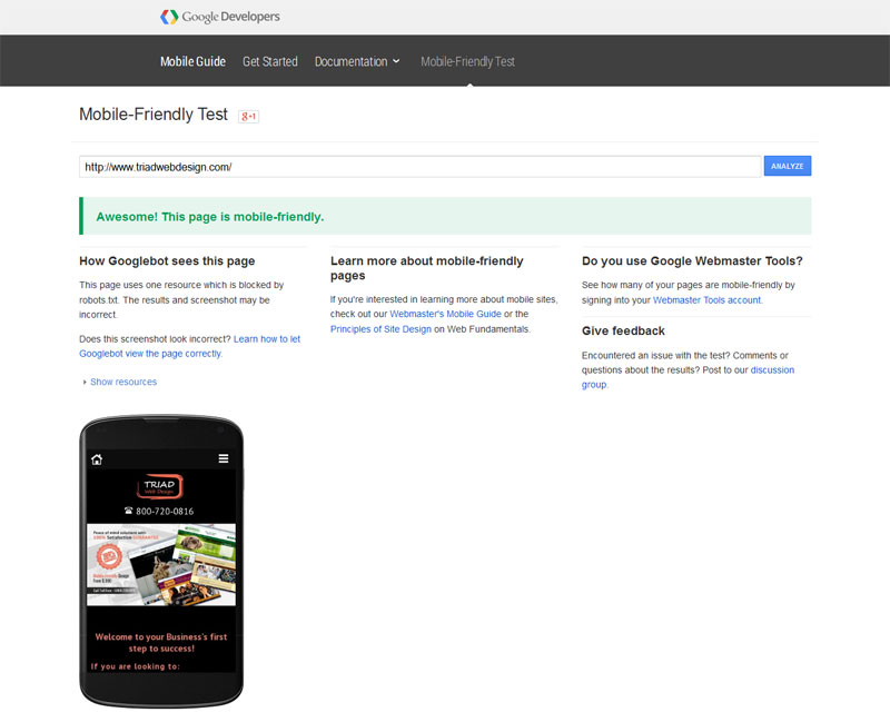
You can test your website here : https://www.google.com/webmasters/tools/mobile-friendly/
You are all good to go if you get a success message like :
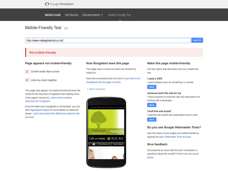
If your website is not mobile friendly, the test result will look like this :
But do not panic. There are some easy ways to fix this situation.
Get a Responsive Design
Incase your website is not mobile-friendly according to Google , don’t worry all you need to do is get a Responsive Design.
Responsive web design serves the same HTML code on the same domain regardless of the users’ device (desktop, tablet, mobile, non-visual browser). Responsive design is Google’s recommended design pattern.
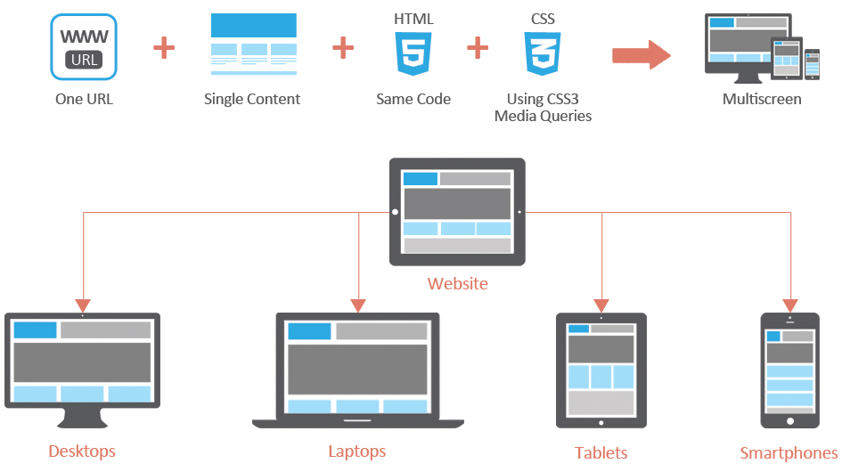
This means that you do not have to create a duplicate copy of your website. The same website will adapt as a user moves from phone to tablet and to desktop.
Here are 6 more reasons why you need a Mobile-Friendly site

Mobile Friendly Sites Benefit Local Business
If you have a local business, you must know that around 50 percent consumers who conducted a smartphone search for a local store, visited the store within 24 hours, according to a study from Google. 18 percent of a local search on smartphones leads to a sale as compared to non-local searches that account for 7 percent. So although you depend on a word-of-mouth marketing for your business, its important that you be aware of the changing mobile behavior of your local customers, taking into consideration the increasing smartphone use in finding a local business and thus designing a mobile website that facilitates it.

Time Spent On Mobile Is More Than Other Traditional Devices
The average time spent by an U.S. adult on television is on a consistent decline from 2010 to 2014. Whereas the time spent on digital mobile devices is on a constant rise. In fact, the study also predicts a decline in the use of desktop with time.

One-Third Online Traffic Is Mobile
Owing to the ever increasing numbers of mobile traffic among global internet traffic, it is highly possible that if you do not have a mobile friendly website, you are leading your potential mobile traffic to a competitor site.

Mobile Friendly Websites Double Conversion Rates
It is not just important to have a mobile website but it must also have mobile friendly elements that makes it easy for your users to get more information in a matter of a few seconds.

Easy Access To Company Information While On the Go
You cannot negate the fact that smartphones have become an integral part of an average person’s lifestyle. So, it goes without saying that your site is probably being accessed while at work or in transit or even while strolling down the sidewalk. So whats your excuse for not having a mobile friendly website? The sooner you build a user-friendly website in favor of your mobile audience, the greater your brand reputation will be. Get in touch with us today !

Responsive Adapts To Future Devices
One of the biggest benefits of responsive design is that the size of the template is designed based on screen size, not device. This means that no matter what size screen someone is viewing your website, it will display properly for that screen size.
So, in the future, as new devices (TVs, watches, glasses, etc.) are being used for web browsing, your responsive site will still look beautiful.
